How can I remove the "Recommended" section on the Start Menu.

acerguy

Member
Joined
Nov 5, 2021
Messages
17
Reaction score
5
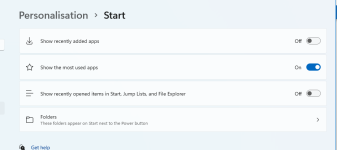
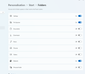
On Windows 11 Start Menu there is the section called "Recommended." I know how to stop putting my last opened stuff in here of course, but I want to get rid of the section all together. It is cluttering up my Start Menu. I don't like it. I can't understand anyhow why someone would want to put the last photo they saw, or the last file they used etc on here!!. Please, how do I remove the "Recommended section? ... Cheers ..
 

davehc

Well-known member
Joined
Jun 24, 2021
Messages
627
Reaction score
151
Something nagging me also! But you can stop it putting anything in there, thrugh the settings.
My main irritant, though, is, having dne that, you are still left with an enormous white square, which you cannot get rid of.
 

Vote:

Trouble

Noob Whisperer
Moderator
Joined
Jun 11, 2021
Messages
352
Reaction score
134
Sure would be nice to reclaim that area for a more practical use, like extending the area for more app icons.
Seems like a nice place to apply some start menu customization?
 

Vote:

acerguy

Member
Joined
Nov 5, 2021
Messages
17
Reaction score
5
Heeeys davehc and Trouble. You both always help me out so good. Thanks for the replies. Looks like we will have to wait until a bit later, it seems Windows 11 is a work in progress. Every time I look at my Start Menu, and get a little annoyed, I will get a coffee, or something much stronger.
Both take care.. Cheers ...
 

Vote:

Trouble

Noob Whisperer
Moderator
Joined
Jun 11, 2021
Messages
352
Reaction score
134
it seems Windows 11 is a work in progress.
To say the least.
Perusing the feedback hub filtered all the way down to start menu and we are definitely not alone in our interest in Start Menu customization and even some specific references to the "Recommended" area and the associated waste of space.
We'll just have to hide and watch
 

Vote:

Ian

Administrator
Joined
Jun 8, 2021
Messages
212
Reaction score
102
Count me in for also wanting this fixed :). I've upvoted the suggestion on the Feedback hub (which has a lot of votes already), so I presume we'll see some movement on this!
 

Vote:

davehc

Well-known member
Joined
Jun 24, 2021
Messages
627
Reaction score
151
Maybe you are not with me:(
I have unpinned all of the apps. The complaint mainly, in this thread, is what to do with the big empty space afterwards
 

Vote:

P A U L

New member
Joined
Dec 15, 2021
Messages
3
Reaction score
0
For a "Pro" version of Windows, I am rather surprised and irritated at the loss of a lot of customizable options that I enjoyed under Windows 7. Also the force feeding of some features/aesthetics that cannot be customized at all doesn't sit well. I hope changes are coming since the OS is still new...
 

Vote:

acerguy

Member
Joined
Nov 5, 2021
Messages
17
Reaction score
5
Omg ,, it's now March 2022. I'm still waiting to be able to get rid of the big "Recommended" section on my Start Menu. Never mind ,, I pray for patience. Cheers ... Take care all. :(
 

Vote:

davehc

Well-known member
Joined
Jun 24, 2021
Messages
627
Reaction score
151
Download and install the latest explorer patcher.. Like you I dislike that emtpy square. The patcher does other things which you may not need, but, it gets rid of that square when you delete all themitems sitting in it and drag it closed
 

Vote:

Ask a Question

Want to reply to this thread or ask your own question?

You'll need to choose a username for the site, which only take a couple of moments. After that, you can post your question and our members will help you out.

Ask a Question

Similar Threads


Top