That Fool Pool Man
Active member
- Joined
- Aug 1, 2021
- Messages
- 26
- Reaction score
- 4
Hiya,
Okay. So. I wasn't pleased that on my 1080p 14 inch Lenovo that the Win11 taskbar icons are... bigger. And that there's no 'smaller' option which I and zillion people in the Feedback Hub agree is necessary. Others are FURIOUS that you can't move the taskbar to the top or to the left.
When you look at all those complaints at the same time... do you see what Windows is trying to manipulate into doing?
If you don't like the look of the big sized taskbar -- turn 'automatically hide taskbar' on.
The result?
1. You gain more vertical height -- which on almost all screens is desperately needed.
2. If you need the taskbar it's still the same move to get to it and click something (albeit it takes half a second longer)
3. If you hit the Windows key you get the taskbar, the start menu, the time, and all that other OS clutter back for a moment
4. There's no longer an argument for a top or left or rightee taskbar -- since -- you don't really see it anyway
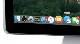
I'm no Windows apologist. But I think this is an intentional design move. Give it a try if you don't believe me. It erases clutter. Do it for a few days and then look at how 'obtrusive' the Mac dock seems in comparison.

Doe you really need these Hasbro apps staring you in the face all day?
Okay. So. I wasn't pleased that on my 1080p 14 inch Lenovo that the Win11 taskbar icons are... bigger. And that there's no 'smaller' option which I and zillion people in the Feedback Hub agree is necessary. Others are FURIOUS that you can't move the taskbar to the top or to the left.
When you look at all those complaints at the same time... do you see what Windows is trying to manipulate into doing?
If you don't like the look of the big sized taskbar -- turn 'automatically hide taskbar' on.
The result?
1. You gain more vertical height -- which on almost all screens is desperately needed.
2. If you need the taskbar it's still the same move to get to it and click something (albeit it takes half a second longer)
3. If you hit the Windows key you get the taskbar, the start menu, the time, and all that other OS clutter back for a moment
4. There's no longer an argument for a top or left or rightee taskbar -- since -- you don't really see it anyway
I'm no Windows apologist. But I think this is an intentional design move. Give it a try if you don't believe me. It erases clutter. Do it for a few days and then look at how 'obtrusive' the Mac dock seems in comparison.

Doe you really need these Hasbro apps staring you in the face all day?
